Keep it Simple …
Cast your eye over a map of the London Underground today and you see a thing of pure beauty.
It’s simplicity personified with clear lines, well-defined colour coding, and easy to read text.
In an instant, travellers quickly know how to get from point A to point to point B with the minimum of fuss.
But it started out rather differently.
Imagine cooking several packs of multi-coloured spaghetti – we’re talking red, yellow, green, and blue – and giving it to four-year-olds to mix up …
And then asking them to finish it off with a thick black pencil – and that’s basically what the map looked like in 1908.
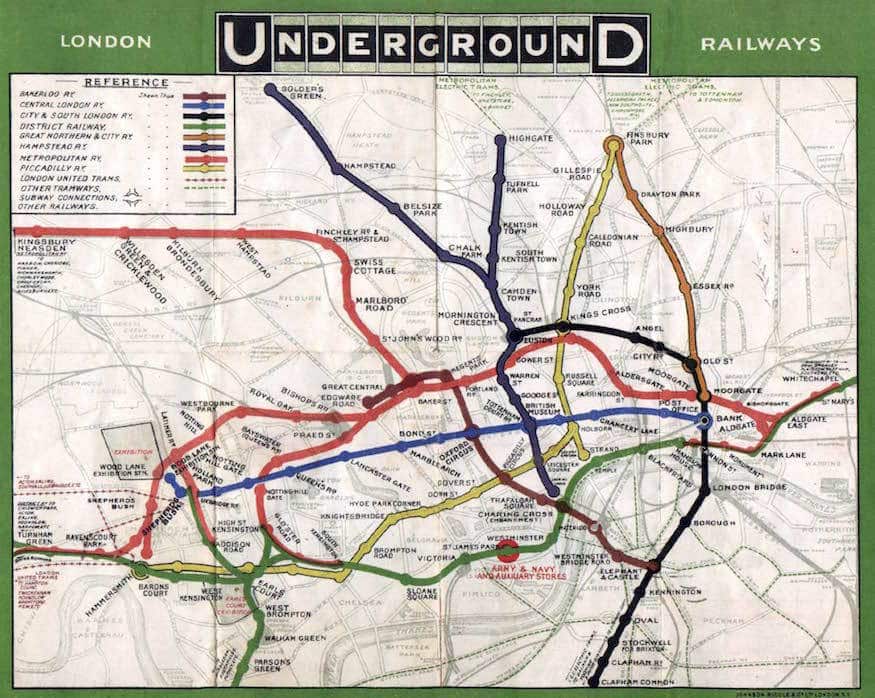
You see, the map makers back in the day tried to do everything a bit too literally.
Which sort of makes sense if you imagine travellers wanting to create some kind of 3D image of the journey in their head. Which of course, they don’t.
Well, not the normal ones, anyway.
Which brings me to the promotional material we use to sell our products and services.
Sometimes, we take things too literally and there’s a valuable lesson to learn here.
Getting our customers from A to B is both an art AND a science and sometimes we need to look at things with a fresh perspective.
Time, maybe, to take a step back and look at whether we’re overcomplicating things.
If you want a sounding board or just want to bend my ear, I’m on hand for a chat about anything to do with Print or Web Design.
Stay safe.
Alec